Hotep
Hotel Kiosk
Scope
Roles
Content Creation
Wire-frames
User Testing
Logo Iterations
Category
Business
Travel
Hospitality
Method
Goal-Directed Design
Individual Project

Interface
Kiosk
Software
Axure
Photoshop
Synopsis
Often, we find ourselves in long check in lines with hotels or issues with check in Room. This can be a nightmare during huge city events or high-volume customer flow. This can be worse with low staff availability. This kiosk could potentially speed up check in times. This works well for hotels that host huge events or expects a huge crowd from a city event. Think of this as a self-service line. This also doubles as a check-out service as well.
Goals
1.
2.
3.
4.
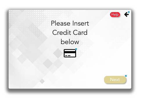
Check-in/check-out using scanners that also takes card on file.
Pay for additional stay, upgrade/downgrade rooms.
Swipe or insert feature
Built-in key card dispenser/ collector.
Research Preparation
From doing research on kiosk platforms, they can come in multiple designs. This kiosk would use a responsive design to fit all screen sizes and adjust accordingly. The physical kiosk would also have a
built-in card reader, infrared scanner, hotel key dispenser and hotel key drop off.
Method
Since Hotep is an kiosk interface, I determined that it would be best to test it using a cognitive walkthrough and task analsyis . This walkthrough was based on a persona of an average student and is based off of an experience that a user would have to go through.
Perspective Users

Name: Jessica Age: 24 Gender: F
Ethnicity: B Reside: Atlanta
Lifestyle: multi-Media content developer. She loves tv series and cosplays in her spare time. She often goes to huge conventions.
Context of use: He would use the Kiosk to check-out conveniently and quickly. She has a lot of bags for her outfits and does not want to wait in long check out-lines
Illustrative quotation: “I love Marvel”

Name: Austin Barkley Age: 37 Gender: M
Ethnicity: C Reside: Alabama
Lifestyle: Works as a construction manager. He Is married with two kids and enjoys college football with coworkers and relatives.
Context of use: He would use the Kiosk to beat check-in lines and quickly to get to his room and apply face paint for the game.
Illustrative quotation: “Roll Tide!”
Competition


Hetras (shiji group brand)
-
Takes up a lot of space
-
Does not offer hotel key dispensaries
-
You have to sit to a desk
Clock-software
-
Requires too much manual information input
-
Un-secure key card basket
-
not enough log in methods, no scanners.
Olea kiosk inc.
-
No scanners
-
Un-secure key card basket
Preliminary Flow
Low-Fi model
In order to build the prototype, I sketched out the basic functions of the prototype. The tasks needed to align with our goals to improve usability.

Early Branding Identity and Style Guide
I defined an early identity for the interface. I wanted to use cool-inviting and relaxing colors. These colors are more suitable for hospitality businesses because of the psychological effect- a blend of calm and relaxed.
In the end, the name "Hotep" was used because of its' Egyptian meaning, "to be at peace." This is the feeling hotel companies aim to give customers as they first walk into their room. The pyramid spawned from the title, which was the beds of royalty. The font Leixo was chosen to match the modern-upscale design of the hotel and Next Art as the secondary.


Wireframing

Early Screen Concepts


User Testing
Interviews
I Had 5 users run through task for the interface. I was able to obtain qualitative data to improve the interface and its usability.
Task Analysis
Each user navigated these tasks:
1. Begin kiosk and choose language
2. Type in confirmation number
3. Check in and use card
4. Complete check in
Peer Reviews
Peers of the same field reviewed the interface and
explored all areas of improvement including branding identity, functionality and overall feel.
Issues found
The results were helpful and data collected was able to improve overall look and interactivity:
1. Capitalized font was too demanding
2. Logo overuse and unclear animations mislead guidance
3. Information and visual needed more order
4. Less screens and more user control
Hotep 2.0 Screens